December 2013 Archives
A few weeks ago I had the pleasure of visiting the Wharton Esherick Studio, lured there by a combination of a work trip to Philadelphia and Chuck Bender's Popular Woodworking article. I knew about the sculpture and the staircase, but seeing (really, feeling) the studio and hearing the story of how Esherick lived there was much more powerful than I expected.
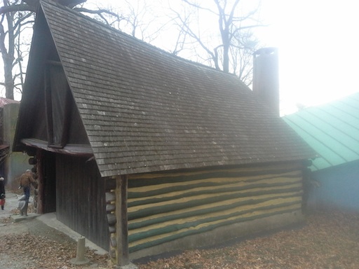
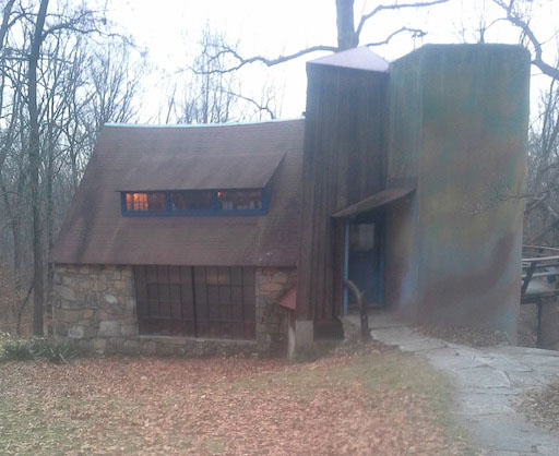
The tour guide had me at the garage and the workshop, which contrasted severely. The garage reflected both Esherick's quirkiness and his need to build cheaply. The workshop may have begun as Louis Kahn's hexagonal vision, but Esherick's insistence on adding curves and leaving the corners looking dovetailed gave me hope that even severe modernism can occasionally tone down to something more fun.

Esherick's log garade, with Kahn's workshop at right.
The studio, though, had a lot of power. The building itself was impressive (though I wonder about the concrete silo), and so much was still where it had been that it wasn't hard to imagine Esherick working and living there. Despite sending many of his pieces on their way to the world, his work was still very present.
The tour made it much more present by inviting us to touch the wooden pieces. Those surfaces were somehow soft, despite obviously being wood. The edges, the finish, the surfaces - all played with the shapes. Technical and design mastery, yes, but also a sense of comfort.
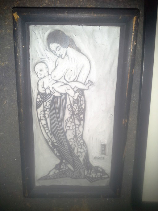
Esherick started out as a painter, took up carving to decorate his frames and create his woodcuts, and then shifted from carver to sculptor and builder. I'm not sure the shift in his furniture from surface decoration to sculptural form is the necessary evolution many modernists seem to praise, but it certainly reflects a change in scale.
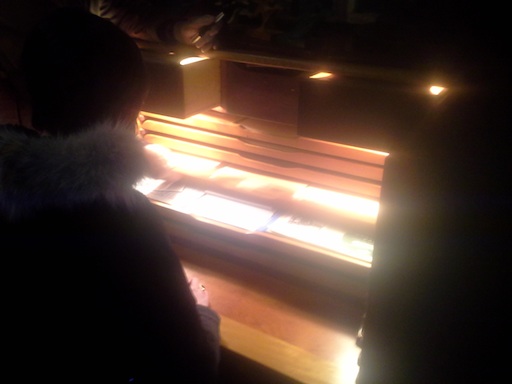
The studio compresses that story into a building and its contents. Because the studio was a combination of where he had worked, lived, and displayed his projects, it was easy to see how the pieces came together. It was even easy, in the case of his desks, to see the similarities that still unified his pieces despite the shift from surface decoration to form. He still liked a similar style of drawer, avoided hardware pulls, preferred softened edges, and achieved a luminous glow in the finish.
The inside of the building is in many ways magical, from the famous spiral staircase to the latches to the kitchen floor made of scrap boards of fruitwood. The copper sinks fit perfectly. The only things that felt to me to be out of place were a linoleum floor in the final kitchen extension and the (completely justified by water) shift to polyurethane finishes in the kitchen. The spaces, both large and small, feel intimate, explorable, and cozy.
Though Esherick wasn't an architect, the choices he made in building the house and the log garage almost created a building that seems like it belong there. The concrete silo seems an odd departure, despite its supposedly autumn pigments, as does the Louis Kahn hexagons shop. At least when he played with the materials of architectural modernism, he made sure the play was evident. I'm not sure either of those is enough to make those attractive, but both were steps outside of him usual work.
The studio and especially the house have me rethinking the way I look at both furniture and carving. Esherick's willingness to explore rounded shapes - concave and convex in multiple dimensions - reinforces my interest in looking beyond square. I don't plan to abandon visible hardware completely, but his desks in particular have me rethinking how components should fit. On the carving side, I still want to explore surface decoration, and in fact I'm inspired by both his frames and his woodcuts. In many ways, I find the early Esherick more compelling, but I love the way that all the pieces came together.

Esherick desk, lit in darkness.
I'll have to go back sometime, bringing a better camera than a cellphone with a crack in the lens. If you'd like to see more, definitely go there. If you can't get there easily, this book conveys as much as can be done in print.


